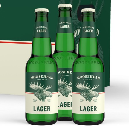
SAINT JOHN, NB – Moosehead Breweries has announced the launch of newly designed branding for its core line-up, including Moosehead Lager, Moosehead Pale Ale, Moosehead Radler, and Moosehead Light.
Developed by Toronto’s Art & Mechanical design agency, the new packaging marks the first time the brewery has a similar style across the four brands. As might be expected, an updated version of the iconic moose in the focal element on most of them with the exception of the Radler series, which instead features images of the flavouring fruits.

“We have a century and a half of incredibly rich history, but for Moosehead, the best really is yet to come,” said Deanna Lichty, Senior Director of Marketing at Moosehead Breweries, in a statement. “This new look is rooted in our history and heritage, but it’s very much about where we’re going next.”
The new packages are rolling out now to all markets across Canada where Moosehead beers are available.

